The page looked good
I'm a designer, and this page sat like that for months before I made it a priority.
On howtoframework.com there's a page called Use Cases. It has 13 cards, one for each guide, like pricing or sales. Each card has an image on top.
It looked good to me. Dark navy and glowing orange. It felt like a set.
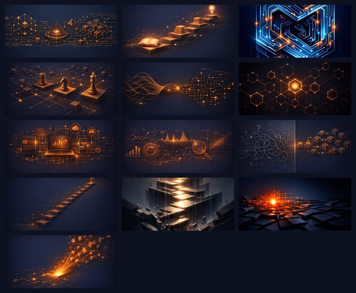
Then I looked at the Operations row. Two of its three cards didn't match.
Client onboarding was a blue neon circuit maze. Quality control was grey blocks lit in pale gold. Everything else on the page was navy and copper.
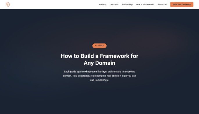
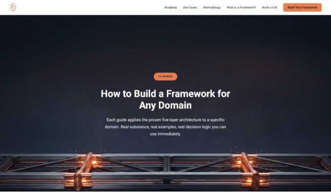
I'm going to call that page version A. Version B is the same page after I wrote the style down and remade every image from it. You can see both below.




Why two of them broke
In April I made a set of 10 card images. I had ChatGPT make them one at a time. I think they were made for something else, and this is where they ended up.
When we added a couple of new frameworks, I filled the gaps with whatever I had.
Nobody had written the style down. So every new image was its own decision. Two of them drifted. One came out blue neon. One came out gold.
They were the wrong shape too. Both were tall portrait files, 800 by 1200 pixels, sitting in a wide card. The card only shows a 180 pixel band, so you saw about a third of each picture.
Looking at the page today, I decided that was a priority. So here we are.
The harder look
Fixing two cards would have been easy. Swap in two orange ones and move on.
But I lined all 13 up at the size the card actually shows them, and I saw something else. This part is my read as a designer, not a measurement.
The other 11 matched on color. They didn't match on what they showed. One card was a laptop with icons floating around it. One was a bar chart with a magnifying glass. Next to those sat chess pieces and a staircase.
Same palette. Different worlds.
If you're just starting out and still figuring out what your brand is, version A is probably where you'll be. There's nothing wrong with it. You pick colors you like, you make things that look good, and mostly they do.
The trouble is the word mostly. Every new piece is another chance to drift.
What having a system means
I asked for the style to become a framework, so every framework graphic from then on would match.
I make these images with Google's image models now. Three days before this remake I tested them on five of my real prompts, next to the OpenAI images I'd already made for those prompts, and I tried a free model on my own Mac on two of them. On quality it came out about even. A second judge, another AI shown only lettered images, picked a Google image over the OpenAI one on 3 of the 5. Google's were faster and a little cheaper, and OpenAI is retiring that model next February. So I switched.
That meant the rules had to work two ways. A person has to be able to read them. And they have to drop straight into a prompt.
What came out is a written style I keep in my framework library as IDENTITY-007, Copper and Steel. It writes down what used to live in my head:
- The palette, in numbers. Exact color codes, the kind your printer or web person asks for. The background is deep navy, #0E1120 to #1A2332. The metal is #B7704F and the glow is #E67E50.
- One physical object per image. The object carries the idea. A staircase climbs. A ring inspects. A scale balances. A die straightens a tangled wire.
- Two metals. The framework calls copper "where the eye goes and what the idea is about," and steel "the precise frame that holds it."
- One warm light, one cool rim. A warm glow from the copper, a cool steel edge light from the upper left. Everything else falls to dark.
- The shape and the file. Cards are 1200 by 800, landscape, always, with the object in the middle half of the height so the band can't cut it. Each file has to come in under 300 KB.
- A fill-in prompt and a check list. Each new image needs two blanks filled in, the framework name and the object, and it has to pass the same checks before it ships.
Nielsen Norman Group says it plainly in its usability guidance: "If you're using images, make sure they're all given a similar visual treatment." The same article says a design system gives a team "a single source of truth for how and when to use components."
For a small brand, that's what a written style is. One place the decisions live, so you stop making them again.
Your brand is cohesive when a stranger can make the next piece from your written rules, and it fits the set without you.
The test
Before remaking anything I tested two directions.
A matched the old set. Same glowing render look, with the two misfits fixed.
B went further. Real polished copper and brushed steel, made to look like macro product photography.
B looked better to me. But two B cards next to eleven old ones read as two families on the grid. B only worked if all 13 were remade at once.
That's the part I'd tell any small business owner. Half an upgrade can look worse than none. A new logo on your business card and the old one on your truck looks like two companies.
I went with B for all 13.
It wasn't clean
The rules made the images. Getting them right still took looking.
Of the 11 cards made straight from the rules, 3 failed the checks the first time. One came back with black bars across the top and bottom. Two had their tops cut off by the card, the king's crown on the chess card and the flag on the staircase. The model ignored two requests to zoom out, so those got fixed by hand instead.
The first quality control image cut its own inspection ring at the tablet crop. The new hero image landed too high and ran into the subtitle on phones. Both got fixed before anyone saw them.
Every one of those got caught the same way: on the grid at the size people see it, against the check list.
After
All 13 cards and a new hero image at the top of the page now come from the same written style.
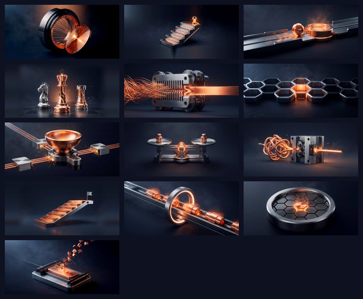
Two things came along that I didn't plan for.
The cards got lighter, because the rules include a file size limit. The 13 old files added up to 2,973 KB. The new ones are 860 KB, about 71 percent less.
And the guide pages had alt text describing the old pictures. The pricing guide's said "Analytics dashboard with charts and data visualization for pricing analysis." That would have sat under a picture of a steel balance scale. It got rewritten in the same update.
Then the part that shows it's a system. The same day, the same rules made 12 new card images for the frameworks page on whereframeworks.com. With the 13 reused, all 25 cards there match. No new design session.
The whole job, both sites, drafts and retries included: 44 images for $6.59 on Google's image models.
Most new cards now start from one fill-in prompt, and a few need a second try. Every one still gets checked on the grid before it goes up. What I don't do anymore is start from a blank page.
You'll see "consistent branding raises revenue 23 percent" all over the internet. I traced it. It comes from a 2016 survey by Demand Metric and Lucidpress (Lucidpress sells brand software), and it's the respondents' own estimate, for companies that already had consistency problems. Nobody measured it. So it's not in this article.
Why a small brand should care
People judge fast. A 2012 Google study found that first impressions of how a website looks form in 17 to 50 milliseconds, and that people prefer designs that look simple and familiar.
They judge on looks, too. In a 2002 Stanford study for Consumer WebWatch, a Consumer Reports project, 2,684 people rated the credibility of real websites. "Design look" came up more than anything else, in 46.1 percent of their comments.
None of those studies measured consistency itself. They show that people judge on looks, and quickly. A written style is how you keep the look you meant, piece after piece.
My read as a designer: most small brands have the taste. What's missing is rules someone wrote down and actually checks against.
One caution. Matching can go too far. The same Nielsen Norman Group article shows Google's app icons after they were redone in shared colors, and at small sizes they get "hard to differentiate."
IDENTITY-007 handles that with one object per card, and no object repeats across all 25. The set matches, and each card still reads as its own thing.
And one limit. This is one page and one set of images. I didn't A/B test it. What I can show you is the before and after, and how it got made.
Getting from A to B
Look at the whole set
Judge every piece where people see it, next to the others.
Put everything side by side at the size people actually see it. For me that was the grid at 381 by 180 pixels, one card on a laptop screen. One image at full size always looks fine.
Then name the misfits and say exactly why. My two broke on color and on shape.
Look hard at the ones that pass too. That's where I saw the 11 only matched on color.
When to do it: something feels off and you can't say what.
Write down what the good ones share
Numbers over adjectives.
"Warm and modern" can't be checked. #0E1120 can. Measure the colors and sizes of your best pieces and write the numbers down.
Then decide what the look means. Copper is the energy, steel is the structure. Once the look means something, every next choice has a reason behind it.
Write it as rules and a check list. If you make images with AI, add a fill-in prompt so anyone can make the next one.
When to do it: the same design question comes up a second time.
Test two before you commit
Judge each option beside what you already have.
Make two versions. One that fits what you have, one that goes where you want to be. Then look at each on the real page beside everything else.
If the better one splits the set, the honest choice is to redo the whole set or wait until you can.
For me B meant remaking 11 more images. It was worth it.
When to do it: before you spend money on the change.
Make the next piece from the rules alone
A system shows up in the piece you didn't art direct.
The rules are working when someone else can follow them and the result fits. For me that was 12 new cards on another site, the same day.
Check every new piece on the grid next to the others before it goes live.
When one fails, the check list names what broke. Then you fix the rule too, so it can't break the same way twice.
When to do it: every new piece.
You don't need a framework library. Put your logo, your truck or storefront sign, your Facebook cover and your business card on one table. Circle the ones that don't feel like the others. Then write one page with two colors as exact codes and one font. Add a line about what your pictures always show. That page is your version B starting point.
Version A is a fine place to start
If I build something for a client, I finish it. My brand is a work in progress, and I'm doing it live for the world to see.
Next year that page will probably have a version C. Maybe a dark mode, maybe something I haven't thought of yet. Come back and look at the Use Cases page then.
Before, it looked good. Now it looks cohesive.
That's what a brand should be going for. Once you figure out what yours is and you have a system, you can have version B.
If you lined up everything your business made this year, which pieces would be your bottom two?
Build the system behind your own look
How to Framework walks through writing your own rules, one domain at a time.
Explore How to FrameworkSources
- Nielsen Norman Group, Maintain Consistency and Adhere to Standards (Usability Heuristic #4), January 10, 2021, read November 15, 2026
- Google Research, Users love simple and familiar designs, August 29, 2012, read November 15, 2026
- Stanford Web Credibility Project, How do users evaluate the credibility of Web sites? (2003 paper; Consumer WebWatch report 2002), read November 15, 2026
- Consumer Reports Advocacy, How Do People Evaluate a Web Site’s Credibility?, October 29, 2002, read November 15, 2026
- Demand Metric and Lucidpress, Benchmark Research on Brand Consistency (press release), November 10, 2016, read November 15, 2026
- My own record of the remake: the images, file sizes and costs were measured from the project files and the live sites on November 15, 2026